Monetization with Behavioral Economics
Over the years I have been testing and reviewing numerous mobile games and apps in different genres. I enjoy deconstructing and analyzing different aspects of the digital products such as onboarding, core loop, social, meta and competitive gameplay. But due to my background in economics, I'm most interested in the monetization patterns.
Behavioural Economics is a fascinating offshoot of economics, which explores the psychology of decision-making process of customers. This post explores five unconventional monetization patterns that differ from the crowd but work incredibly well. Each of these patterns is based on a behavioral economics principle.
What is Behavioural Economics?
But before we dive into what these patterns are, let's understand the underlying Behavioural Economics Principles and how they apply to these unconventional patterns. The study of psychology relating to the economic decision-making processes of individuals and institutions.
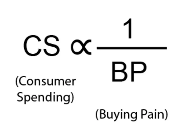
Consumer spending is inversely proportional to buying pain, which reflects how much pain spenders feel after parting with a dollar.
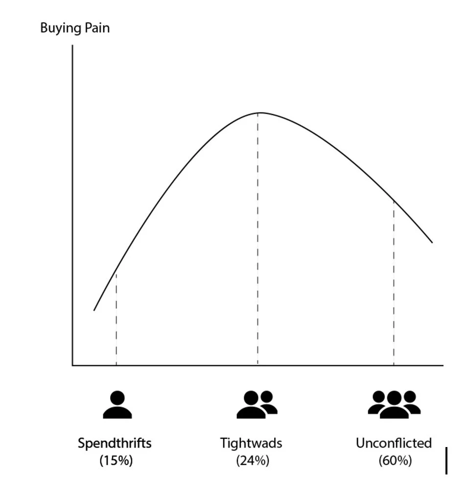
Behavioural Economics divides consumers into 3 distinct categories, based on how much buying pain they endure while spending:
Tightwads (24%): These customers spend less on average before they hit their pain limits.
Unconflicted (60%): These are your average spenders.
Spendthrifts (15%): These customers spend more on average before they hit their pain limits.
Studies prove nearly a quarter of buying pool is 'Tightwads', these customers have a very low threshold for spending due to high buying pain sensitivity. This spread is even more skewed in free to play games where only 1% of your player base actually opens their wallet!
One of the most asked questions is how to reduce buying pain for 'tightwad' customers?
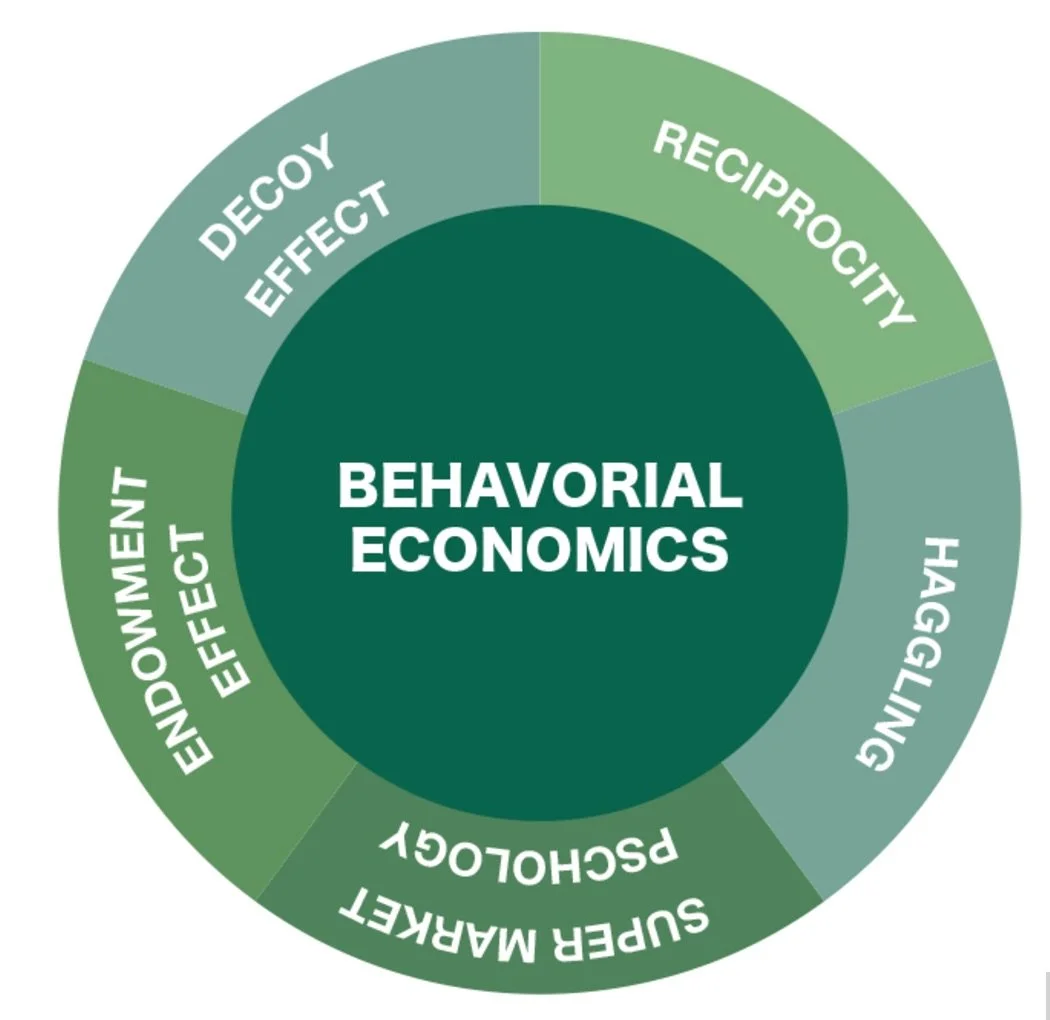
The answer lies in the five elements of behavioral economics, which essentially make the product's cost less painful.
1) DECOY EFFECT aka. Price Anchoring
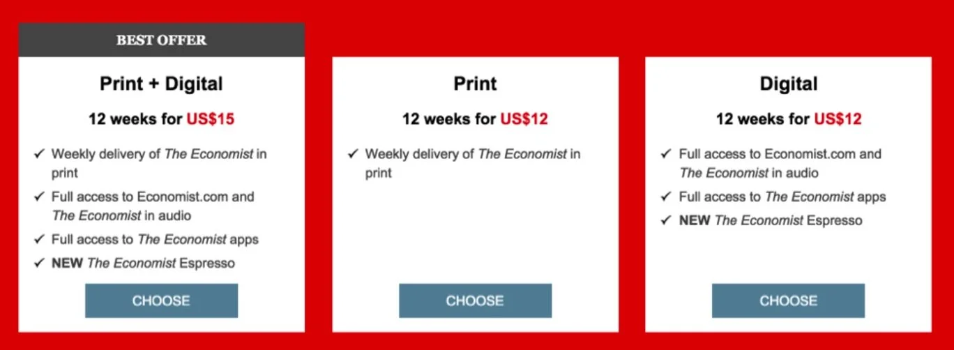
Choices often occur relative to what is on offer rather than based on absolute preferences. The decoy effect is technically known as an ‘asymmetrically dominated choice’ and occurs when people’s preference for one option over another change as a result of adding a third similar but less attractive option. A customers decision making changes depending on the decoy thrown into the mix.
This short video shows Decoy Effect in a nutshell
Basically, if people are given options to purchase a large popcorn for $7 and small popcorn for $3, people will purchase as per their normal preference. But if we introduce a 3rd medium popcorn option for $6.50 (which is marginally better in terms of value/volume than the lowest price but inferior in value to the highest price option) It will shift peoples' focus from low cost value to purely the comparison between the decoy and the highest priced option.
People tend to feel they can get way more value by paying just marginally more and therefore feel smart about it.
Anchors distract customers' attention to the options companies want them to buy whilst giving the feeling of satisfaction of having outsmarted the system. In the example above, both options B and C are actually decoys to up-sell option A, which provides value offered by both the packs for mere $3 more - which is a no brainer for the customers.
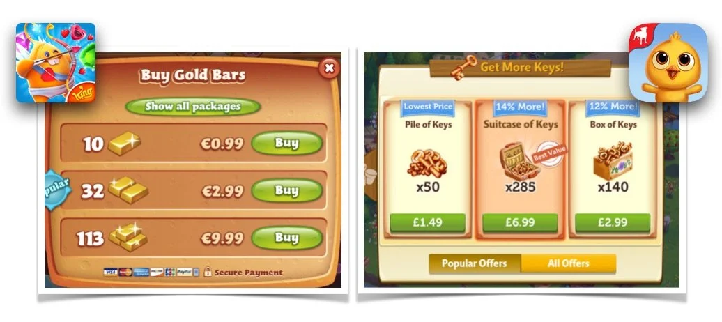
Many mobile game shops use this kind of decoy anchoring to sell high-value price points. For example: 'Diamond Digger Saga', 'Farmville 2' - when the player clicks on the shop, he is only shown 3 options up front which use decoys to anchor player preferences.
This helps reduce choice bias by not offering players an overwhelming number of options which can lead to choice paralysis and help conversion by using of decoy anchoring. Notice in both the above screens, there are "More offers/packages" buttons which range from 5 to 10 offers, but for decoy effect, only 3 are shown up front.
2) RECIPROCITY aka. Free Samples
Reciprocity is a social norm that involves in-kind exchanges between people, mainly responding to another’s action with another equivalent action. It is one of the basic laws of social psychology. It says that in many social situations we pay back what we received from others. In other words, if someone does you a favor, you're likely to return it to him. Charities often take advantage of reciprocity by including gifts in solicitation letters, while supermarkets try to get people to buy more by offering free samples. Restaurants & stores worldwide lure customers with bite size versions of their food, trial products even.
So, how can this real world model be used in virtual stores in games? Popular match-3 games from King.com utilize this model and psychology to their advantage:
the Case of King's Pet Rescue Saga
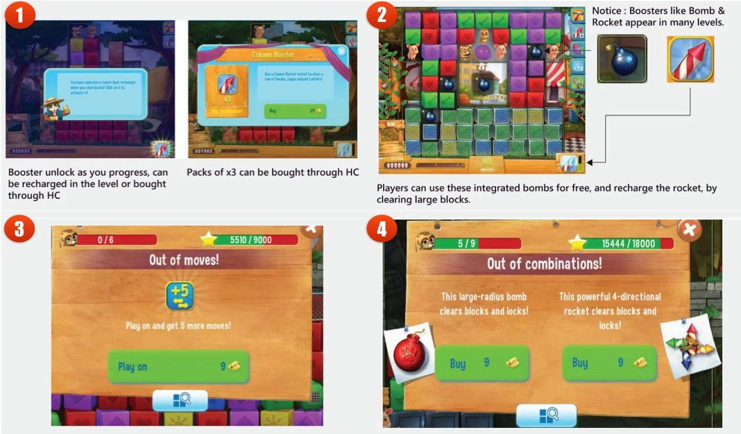
Pet Rescue Saga initially follows the same design as other match-3 games wherein player can unlock the boosters as they progress. They get few boosters to sample and once you run out of those, promptly prompts you to buy more.
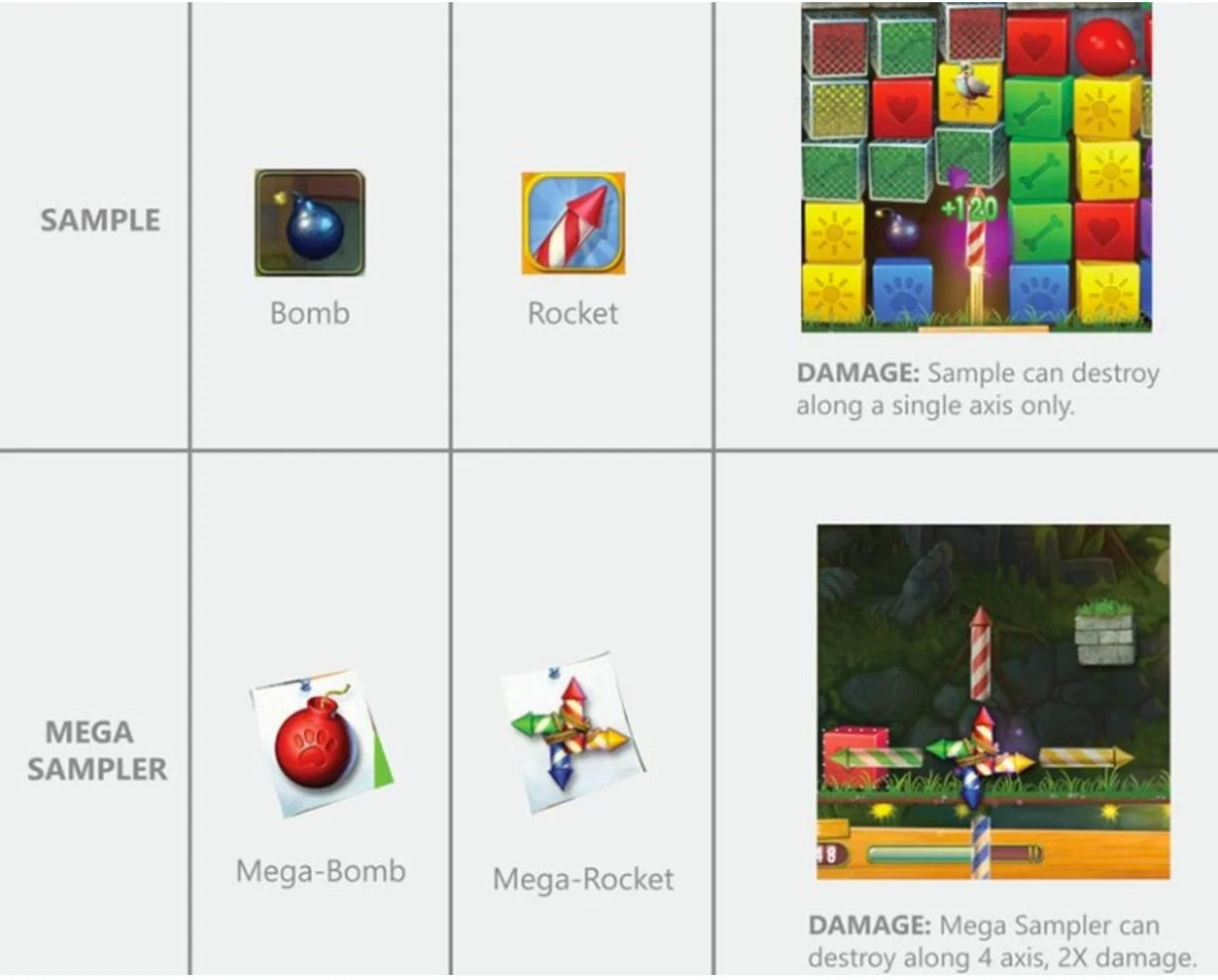
Pet rescue has many boosters but there are a few common ones displayed at various levels like the BOMB and ROCKET; that is not available for purchase in the game. In the early levels, if I fail, I would see the typical "Out of moves - purchase +5 Moves" screen. But this initial behavior changes over time. As players progress deeper into the game, failure screens prompt changes to accommodate new kinds of boosters - ones that cannot be equipped up front but are only available at failure screen.
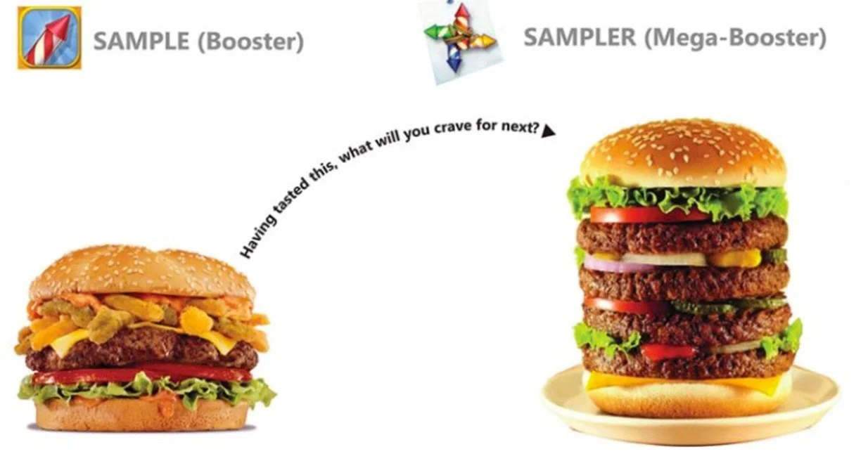
You may ask, what's the big deal? They just replaced "+5 moves" offer at failure screen with a bunch of random boosters? Look closely. The new offers are POWERED UP versions of existing boosters the ones that players occasionally consume for free.
To use a real life example, here's what is happening:
There are other King.com games as well which use this model frequently which I have covered in another article. Find the full article here.
3) COUNTER OFFERING aka. Bargaining
Behavioural Economics Strategies are designed for bargaining and reducing the pain of purchase for the customer. This weighs in significantly into customers purchase-decision-making process.
Bargaining/counter offering has been around for ages. As humans, people love to bargain before actually making the purchase. Both buyers and sellers understand this and leave room for significant margin in the marked price of goods. Even in an era of fixed prices, shoppers always compare prices with other stores & e-commerce sites like Amazon, Macy's etc. to get the best deal & feel empowered.
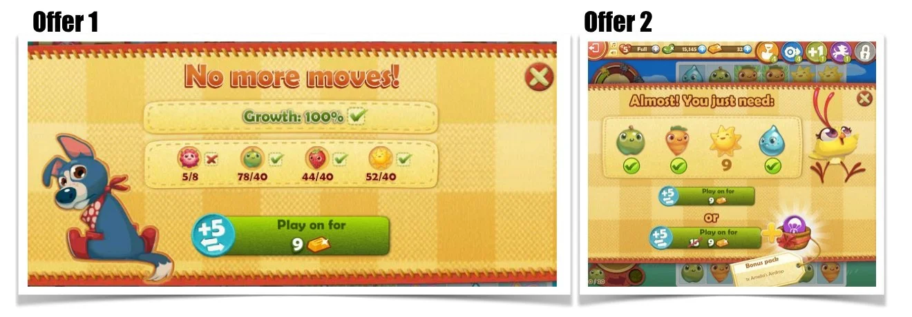
So, how can this real world model be used in virtual stores in games? Many free to play games have been using this lately. Observe the below example from Farm Heroes Saga, a typical match-3 game scenario. When player runs out of moves before completing a level, player receives a purchase message:
In in King's Farm Heroes Saga the first offer when player runs out of moves is 5 moves for 9 gold . However, if the player doesn't convert, they will receive a discounted counter-offer next time they run out of moves.
Observe how the price for the purchase is same - 9 gold bars - but the deal has been sweetened by giving players extra value by bundling in a bonus pack that offers higher value compare to the previous offer!
Also, notice how the new offer is given as a choice now instead of just showing one price button, two price buttons are shown. This lets the players know on a sub-conscious level that they are being offered a counter offer. There are also subtle visual changes like difference in sizes and slashed prices that help up-sell the new discounted offer.
4) ENDOWMENT EFFECT - People ascribe more value to things they own.
In psychology and behavioral economics, the endowment effect, also known as divestiture aversion & related to mere ownership effect in social psychology, is the hypothesis that people ascribe more value to things merely because they own or create them.
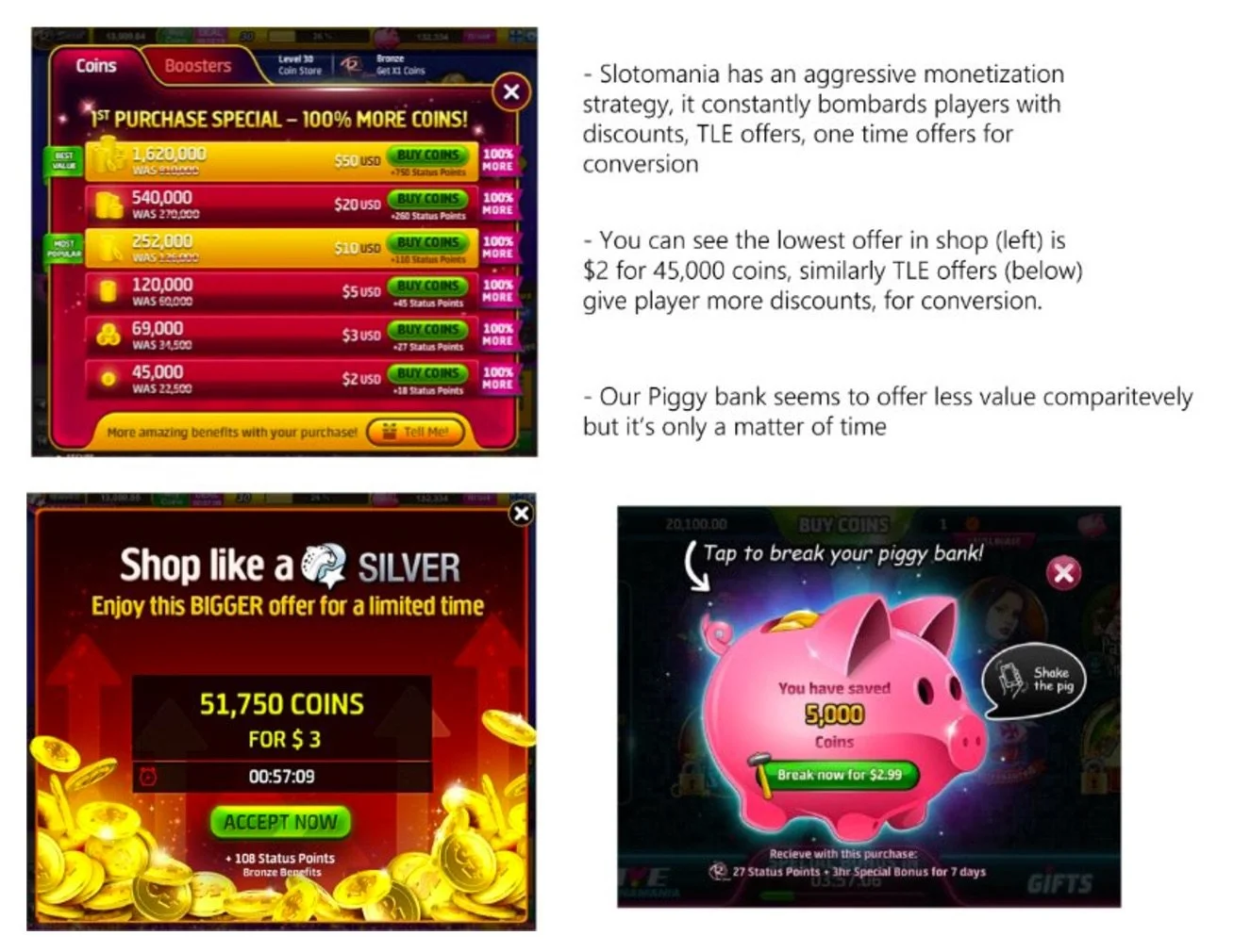
Playtika's Slotomania utilizes a unique monetization model based on endowment effect. It is used as an effective conversion mechanism by making people feel smart about their choices.
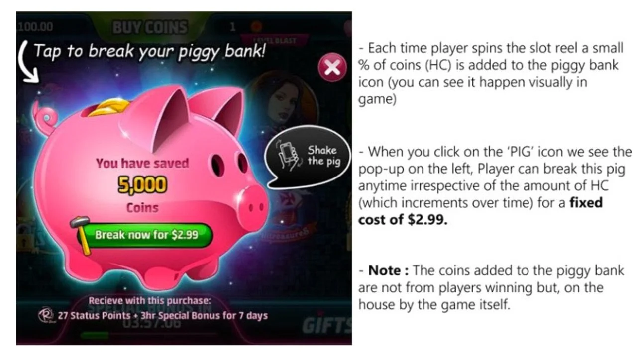
In essence, Slotomania creates an IAP that follows the mental model of a ‘Piggy Bank’ in real life. Player sees her efforts as Winnings + Time spent in the game =< the amount of HC the Pig holds. But how does this make the player feel smarter or different from any other IAP in the game? Why should player buy/prefer this offer?
For $3, shop offers 45,000 coins, for $2.99 the time limited offer is 51,750 coins. But breaking the pig offers only 5,000 coins. Right?
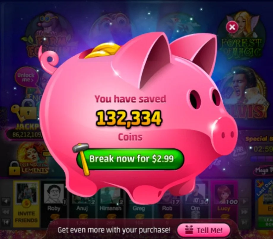
However as Player keeps playing the game, the Piggy Bank keeps swelling. Players every spin adds free coins in to the pig and as you can see, it now offers 132,334 coins for the fixed cost of $2.99! It beat the lowest shop offer (45,000 coins for $3) and the limited time offer (51,750 coins for $3) by a huge margin and looks like a smart buy.
In addition to the endowment effect, we can also say the other offers act as decoys to push the Piggy Bank purchase. Psychologically, player feels the amount in the “Piggy Bank” is a result of his own campaign. Amount in the Bank = Time spent by player in the game. This creates attachment.
Full Article here
5) SUPER MARKET PSYCHOLOGY - Show customers what you want them to buy
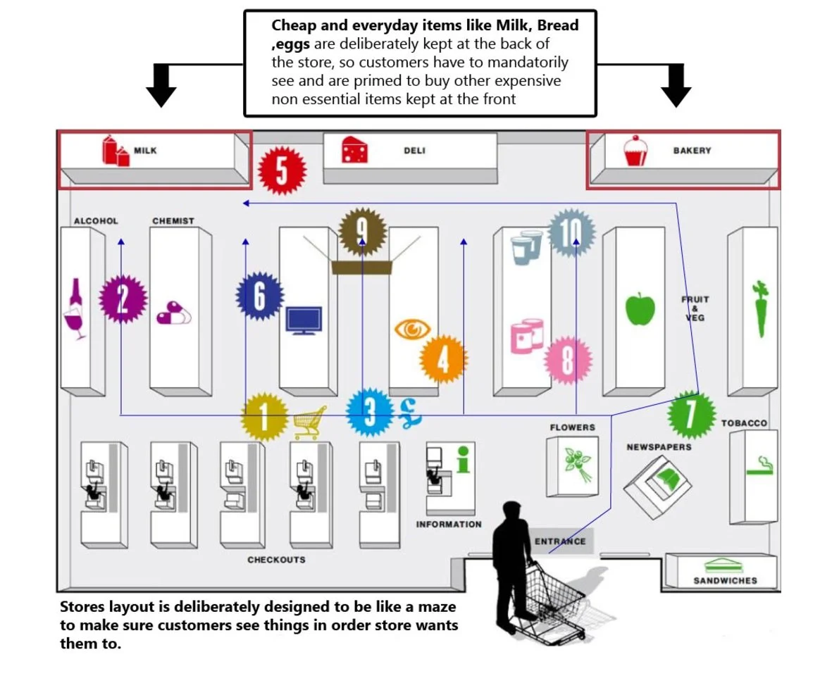
When you walk into a supermarket, you probably want to spend as little money as possible. But the supermarket wants you to spend as much money as possible and it's literally baked in to their design. As you have likely noticed, in any super-market or shopping centre, the most essential or daily use items are always kept at the back of the store. This forces the customers to go through and see all the high-margin items, which they were are not planning on purchasing.
This is the de facto store layout strategy is used by majority of supermarkets around the world.
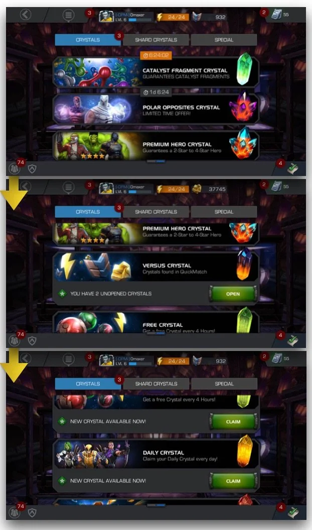
This real world model is used in virtual stores in games. As an example let us look at the super market psychology implementation in Marvel Contest of Champions.
In the example above vertically scrolling crystal inventory shows player the purchasable high vanity and visually impressive items the moment they land on this screen. Player then has to manually scroll down to see or claim the crystals s/he has won in battles.
The idea here is to send the player as often to the shop/inventory space as possible, which is done by giving player free hourly and daily crystals. This ensures the player comes to this space frequently.
Any UX designer would, under normal circumstances, think of making the screen more accessible by sorting the list with free or ready to open crystals at the top and not hide it under a scrolling list at the bottom so players do not have to put in much effort to find it.
But in this case the flow is designed to prime players to come to this store as often as possible & notice the high vanity stuff using supermarket and retail psychology. Free items are deliberately hidden from players view, making them first see the premium items before finding their way by scrolling down to to the 'bread and eggs' of the in-game market.
Read to full article here
CONCLUSION
Strategies illustrated above have been used in marketing of products and services for ages, but as we move to the era of digital and virtual goods, same sound principles can be integrated in to customer's journey without appearing too invasive by clever UX design.
The five elements of behavioral economics are decoy effect, reciprocity, haggling, super market psychology and endowment effect.
Price anchoring, free samples, bargains, endowments and super market layouts are all proven approaches in real-life. Top mobile developers have employed these strategies for few years now and I believe that in the near future use of behavioral economics in free-to-play games will be more of a rule than an exception.

