If Vainglory Doesn't Make it, No One Will
In short: Vainglory is without a doubt the best MOBA that has or will be made for touch screen devices. It's a giant fish in a very small pond that is the MOBA category on touchscreen devices. If the pond grows into an ocean, it's only because of this game.
Super Evil Megacorp's (SEM) Vainglory is easily the most hyped mobile game of 2014 - and for a very good reason. Vainglory delivers a true multiplayer online battle arena (MOBA) with unseen graphics and a game engine that can run this piece of art at a massive worldwide scale on touchscreens.
Vainglory is MOBA on mobile, not MOBA for mobile. It stays true to the genre with a large enough map, multi-dimensional champions, complex item strategies and long game sessions. In fact, the only casual part about this game is that it's on iOS. Vainglory is a core game for touch devices and its ambitious goal is to bring core games onto the touch platform.
Vainglory is not perfect. It lacks many small but essential elements needed to establish MOBA as a meaningful category on touch screen devices. The most obvious holes in Vainglory's feature set is the lack of competitive and social features. But a team that was able to build this kind of game will surely over-exceed all the expectations with future updates. In the end, Vainglory's success will ultimately show whether touch screen devices are suitable for MOBAs as it is hard to imagine a better representative of this genre.
GAMEPLAY
Vainglory, at its simplest, is a battle between two teams of three players who each command a hero. The goal is to shatter the other team's Vain, a massive crystal located in the heart of team's base. Both bases are guarded by five turrets, which the team has to destroy in order to get to the Vain.
On the team level, there are two different paths players can take when attacking each other's base. The main attack route is the lane, which is guarded by the powerful turrets. Each team also has lane minions, which spawn automatically. Your minions help you destroy the turrets, so you need to clear enemy minions and protect your own. The secondary attack route is the jungle, which holds two minion mines, a gold mine as well as the powerful Kraken. By taking over the minion mine on your side of the jungle, your lane minions get stronger. By taking over the minion mine in the enemy’s jungle, your minions get really strong and deal considerable damage to turrets. The gold mine fills up every few minutes by killing the gold mine, your team gets whatever the miner has in its purse. At 15 minutes of gameplay, the gold mine is eaten by the Kraken. Capturing the Kraken isn’t easy and whichever team takes her down, will have the Kraken fight on their side. Balancing between these two attack routes (lane and jungle) requires relentless teamwork.
On the individual’s level, each player starts every battle from level one. The goal is to gather experience points and gold as fast as possible. Experience points are awarded mainly from the battle against minions, jungle creeps, and enemy heroes. Experience points make the character stronger by leveling up you also unlock and upgrade unique skills. The majority of gold is earned by delivering the killing blow in the battle. Gold is used to purchase items, which not only improves but also affects how a player plays the hero.
Heroes

At launch, Vainglory has a selection of 10 truly unique heroes for players to choose from. Compared to
Fates Forever, these champions are exponentially more difficult to play with, yet alone master. Vainglory stays true to the MOBA genre with its hero design. It is a skill-based game that insists players learn the strengths and the weaknesses of every champion along with the item and map strategies for each of them. Without an extensive amount of time reading through forums and watching Youtube and Twitch videos, a player that is new to the genre will simply lose battles and likely quit the game out of frustration.
(Checkout Vainglory Fire if you're not a skilled MOBA player and you'd like to win some battles)
The design and balance of each hero in Vainglory is simply amazing. It takes a mastermind to create champions, which can be played in so many ways.
Generally speaking, mobile and tablet players are used to very different learning curves. For example, learning to play Clash of Clans is very easy while mastering it will take a significant amount of time and effort. It seems that Vainglory is targeted mainly at existing or lapsed MOBA players who are used to support their gameplay with extensive guides and gameplay videos. On the other hand, the learning curve for Vainglory is significantly lower for experienced MOBA players as the game design strongly follows the best practices in the genre.
Performance & Controls
Super Evil Megacorp's proprietary game engine (called E.V.I.L.) is, simply put, out of this world. It enables synchronous multiplayer game between six players with console-quality graphics and ultra-precise controls. In fact, I've experienced only one drop-off during the months I've played the game and that was due to my poor WiFi connection.
From a technical perspective, the controls in Vainglory are close to perfect. The responsiveness allows skill-based gameplay and there's no forced adaptation of swipe mechanics. Personally, I love the responsiveness but I dislike the control design that forces me to play with my two index fingers instead of playing with my thumbs via virtual joysticks. Basically, the optimal gameplay requires putting the iPad on the table at a specific angle, which is essentially pretty much how people play browser MOBAs on PC. It's probably comfortable for browser MOBA players but definitely not something that players are accustomed to on touch screen devices.
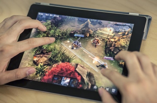
Vainglory's controls are technically bulletproof but the fact that you have to play a tablet game with two index fingers feels unintuitive.
Players playing the game with two thumbs are at disadvantage. The main skill buttons are located on the bottom bar instead of the sidebar where they could be instantly accessed with a thumb. In a fast paced skill game, the difference between milliseconds is the difference between being a killer and a victim. The design of controls also prioritizes the large screens of iPads over iPhones.
Session Length, UX and Art Style
Even though Vainglory is made for mobile, it's not designed like a typical game on the platform. The average battle in Vainglory is about 20 minutes, which is not far off from battles in rival browser MOBAs. Each battle requires full concentration and leaving a battle will not only lead to punishment from the game but also destroy the player experience for the rest of the team who will be left in an impossible 2 vs. 3 situations.
The lack of platform specific design is also visible in the overall UX of the game. At the moment, Vainglory's UX offers both ends of the extremes as it switches between minimalistic design into a full-on spreadsheet and back again. For example, the game is filled with numbers, whether a player is choosing a character or purchasing an item from the shop, yet during the gameplay itself none of the numbers are actually shown.
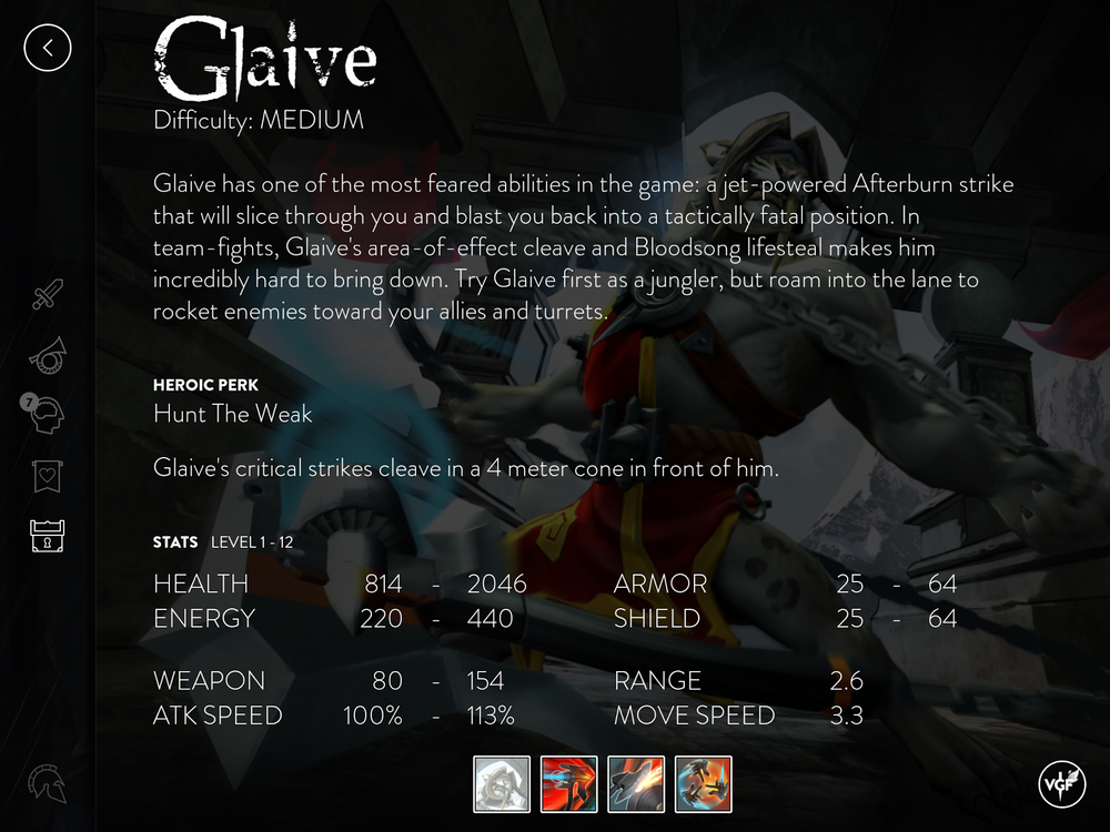
Vainglory's UX is at the moment quite intimidating. For example champion info may easily overwhelm players with its undigested information. In order to gain the basic level of actionable information, a player has to actually exit the game and head to YouTube and forums.
For me, the most difficult part of Vainglory at the moment is managing a hero's skills. Executing each skill costs mana. After I’ve used an ability, there's a cool down period. Each champion has a mana bar, which is the tiny blue bar below the health bar. A player can purchase items to increase regeneration and maximum capacity of the mana bar. This all sounds very clear because you make decisions based on numbers shown in the shop. Yet in the game, there are no mana cost numbers on the abilities, nor a number showing how many mana points you have left. Because of this, I can only vaguely tell whether I'm able to cast an ability once the cooldown has passed making chained skill attacks more difficult to execute.
Visual feedback is also very inconsistent at the moment. There are attacks such as Joule's Big Red Button, Saw's Suppressing Fire and Glave's Afterburn that are great examples of clear visual communication. A player activates a skill and enemies in the hit-zone are affected by it. Sadly there are numerous actions and consequences in the game that the player can't explain. For example, sometimes when I ambush and attack an enemy champion, it suddenly starts gaining massive amounts of health and I end up getting killed. I cannot figure out if there's a skill that does this. Is it an item they used? Or maybe it’s a consumable?
If I could wish for only one improvement in the UX it would be a "kill info". I want to see what skills were used to take me down and what items that champion carried at the moment of the final blow. This would allow me to learn champions, items, and skills faster. The score information screen after the game doesn’t provide information about each death, just the overall item builds.
As said, Vainglory has some of the most amazing art seen on tablets. The concept images of heroes are powerful, the environment art is breathtaking and the animation is fitting. Yet when you put all these elements together it just doesn't seem to work as intended.
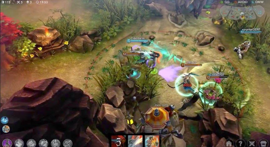
The beautiful environment art and amazing character art are both equally detailed, which together with the dark lighting leads to situations where champions can't stand out as they should.
Personally I just feel like there are too many elements fighting for the player’s attention as every hero, environmental element, and backdrop is all equally detailed. The lack of art hierarchy combined with overall dark lighting further complicates visual communication of the game. I believe that with less detailed environment art this would be less of an issue.
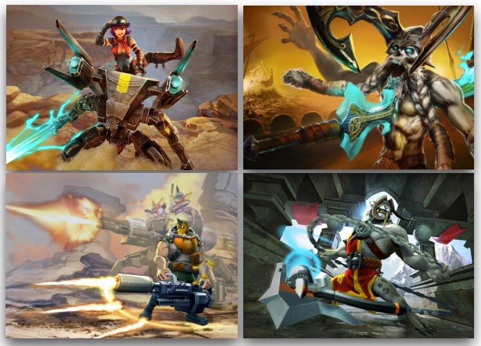
Vainglory features some of the most beautiful art ever seen on touch screens. Yet the overall art direction is not a sum of its parts. In addition to a mismatched theme of fantasy and Sci-Fi, the highly detailed champions get lost in the equally highly detailed environment art of Vainglory.
Vainglory also seems to lack a consistent theme for art. Nothing, from the arena to the heroes, seem to quite fit together. For me, it's just a mismatch of themes when I see an undead Viking with a sword fighting horned beasts in a jungle while being attacked by a mech warrior and a half-man half-mountain-lion. Yes, I know it all sounds great but for the majority iof players it likely isn't. For a game with 10 champions and one small map, this lack of a unifying theme just creates more confusion for players who are new to the genre and need all visual guidance they can get. A theme doesn't have to be as clear cut as e.g. Fates Forever but it doesn't have to be as far apart as it is now.
RETENTION
Hero brawlers are very polarizing games. Firstly, they require a significant time investment not only due to session length but also by demanding players to learn how to play with and against each of the heroes.Secondly, MOBAs are team games. You could be a skilled player but if you are matched with players who don't know how to play as a team or with players that just quit in the middle of the 20-minute session, your game experience will turn sour (this is naturally something matchmaking system aims to address).
How does Vainglory deal with these challenges? Well, it doesn't. This game is designed clearly for players familiar with the genre. If you don't know what MOBAs are and you're playing this game without a friend sitting next to you and explaining what to do there's only a slim chance you'll enjoy yourself.
The Tutorial
Personally, I see tutorials as trailers for a game. As a developer, a tutorial is your way to show players all the cool stuff that your game has to offer. The goal is to convince new players to invest time in your game. To make them want to play more. I believe that the first time experience needs to be engaging, interesting and fun. Vainglory's tutorial doesn't fit my description of good first-time player flows.
Overall, I don't want to bash Vainglory's tutorial. It is what it is and I'm sure that despite a massive drop-off rate, the players that stick around with this game for a week, stick around for a very, very long time. I just personally wish that the team would create a first-time player flow that, not only avoids all the edge cases but also engages new players instead of testing their durability to withstand dull written instructions. There's no need to turn away all the new MOBA players after they just downloaded the game.
Long-Term Goals
Vainglory has some of the most amazing design and balancing as well as probably the most beautiful environment art I've seen on the small tablet screen (I play on a mini). The game looks beautiful on the outside but its true beauty is found under the hood, in form of an engine that seems to effortlessly run this masterpiece of a multiplayer online battle arena at a massive scale. But despite all these amazing elements, there's still something small yet relevant missing. At the moment Vainglory is like a wagyu steak without the side order, or caviar without the blini if you will.
At the moment, a player's only long-term goal is to earn enough soft currency to purchase a hero. Apart from the painfully slow grind, there are no runes, no leaderboards, no events, no leagues, no daily challenges and no guilds or teams. And don't get me wrong, the battle is amazing, but we need to battle for something.
What one has to keep in mind is that the game has just launched globally and will grow with each update to come. I'm hoping that the following updates will not only be about monetization through new heroes and skins (?). Personally I'm good with these characters for now as long as I can get all the missing competitive and social elements that will eventually enable Vainglory to create a new genre in mobile gaming.
SOCIAL + MONETIZATION
The key selling argument for a tablet hero brawler is the easiness to set up a good old LAN-party. Everyone has an iPad. It weighs practically nothing and is as portable as a phone. These hardware characteristics make it easy for players to meet up and start a game together.
Vainglory makes the most out of team play. Adding players is extremely easy and starting a game together is straightforward. But most importantly, playing together with a friend or two is simply a lot of fun. It starts off with clear and calm communication and culminates in screaming, shouting and high-fiving as you team up and break down the competition on your route to flawless victory.
One thing that I don't understand though is why Vainglory doesn't allow players to connect through Facebook or Twitter. It's just weird that the game doesn't want to let me know that some of my hundreds Facebook friends are playing as well.
If you’ve played DOTA2 or LOL you’ve probably experienced the toxic language from co-players taunting you for every mistake you make. Theoretically allowing players to chat through microphones in the game is great but in practice it sucks. I’m sure that’s why Hearthstone doesn’t use the microphone for communication between players and I'm happy that Vainglory doesn't do this either.
The main in-game communication tool in MOBAs is the ping message system, which allows players to quickly choose and send pre-written messages to the team. Fast messages like “Follow Me”, “Help!”, “Defend!” are enough to work as a team in the heat of the battle. This feature exists in Vainglory and is very useful in the tablet version. Sadly the map is so small on the iPhone that it often leads to misplaced pings.
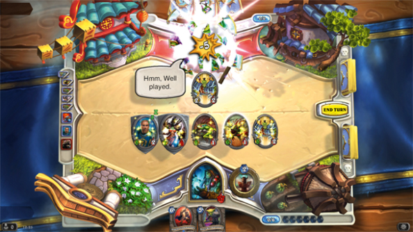
Vainglory's in-game communication is limited to command pings. Unlike in Hearthstone, there's no way to threaten, boast and taunt in the game.
Chat between players leads easily to some of the worst online behavior (in addition to the bandwidth costs) and thus I completely understand why Vainglory doesn't offer in in-game communication channels. Yet, on the other hand, it's a competitive PvP game. I want to boast and taunt after a beautifully executed kill. Personally, I believe that Hearthstone has a pretty solid solution for in-game taunts that aren't offending.
Lack of Guilds & Events
Guilds and events combined with competitive leaderboard-driven events supercharge games. Vainglory doesn’t have any of the above elements (yet?) and thus the game lacks social pressure that drives engagement. Personally, I wouldn't even launch a competitive game without a leaderboard. It's extremely important to shine a light on your top players and a leaderboard is the base tool for this.
Single Source of Monetization
The backbone on monetization in MOBAs is the champion rotation system, which gives players access to only a fraction of champions at a time. The main goal is to have players trying out new champions on a regular basis. If they happen to like a particular hero, they will need to purchase it as the game will lock it after a short time.
League of Legends, which grosses over 1 billion dollars a year, has dozens of champions in constant rotation. In addition to the champion rotation and the steady introduction of new heroes, LoL also monetizes through character skins, which allow players to customize the looks of their favorite champions. Also, boosts, such as doubling the value of soft currency earned from each match, are extremely well-selling items in LoL.
Most of the MOBA games emulate LoL's monetization model without truly looking analyzing the numbers. You see, monetization is a result of a number of active players, conversion and average revenue per a paying player. League of Legend has pretty poor conversion and average revenue per paying player but it has an unbelievable reach of way over 12M daily active players.
So if you look to emulate LoL's monetization, you're looking at a massive amount of players - but the thing is, Riot already owns them. There's no reason for them to start playing another MOBA and forgo the progress they've made in LoL.
Vainglory's monetization capability is currently very low as it has only 10 champions in the game out of which only 4 are locked at a time. The hard currency price of a champion varies between a couple of dollars to around five, which is ridiculously low for a mobile game. Vainglory also doesn't offer skins or any kind of boosters like its rivals on the browser.
In addition to having very low monetization potential, Super Evil Megacorp shot itself in the leg when the game launched globally. The company decided to give all of their players in South East Asia over 20$ worth of soft currency which converts to around 200 hours of gameplay. The idea was noble: thank the players who had played the game during the long soft launch. In reality they destroyed the need for that mostly loyal player base to stay super engaged by grinding soft currency. You see, these players (I'm one of them) now have enough soft currency to purchase all the champions they like and they will still have enough soft currency to purchase 6 - 8 champions that will be introduced in the future. Less harm would have been done if these champions would have been simply unlocked to the South East Asian players or by selling a "Humble Launch Bundle" with all the heroes.
WATCH OUT OF SUPER EVIL MEGACORP!
Vainglory is the first game from Super Evil Megacorp and it is most welcomed to the touch screen market, which is filled with social games and clones of clones. It's an extremely ambitious game that aims at not only creating and owning a whole new genre in touch screen gaming, but also luring core gamers onto the platform.
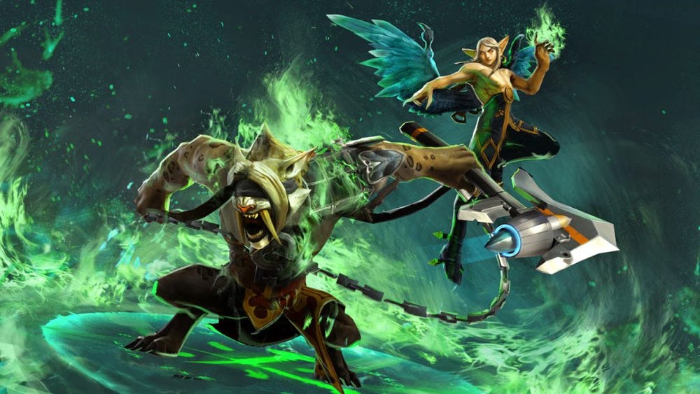
Time will tell whether Vainglory will be also a commercial success. As a game maker, I truly wish they'll succeed as it would open up the market for more core games. Games that I love to play and make.
At the moment, Vainglory is far from ready and should be seen as work in progress instead of a finished product. The game is desperately missing key social and competitive gameplay elements that will eventually drive engagement and monetization. Also, the UX needs some polishing and I hope the team is humble enough to get inspired by other touchscreen games like Fates Forever and Hearthstone instead of browser games like League of Legends. Yet I don't think anyone truly doubts that the team behind this magnificent game will have trouble in closing those holes with a steady stream of upcoming updates.
Time will tell whether Vainglory succeeds in its extremely ambitious goal but one thing is for sure already - Super Evil Megacorp is a company to watch for. They remind me of another company that once had an ambitious goal with theirGunshine game...


