Chrome Valley Customs - Can a Male Audience and a Puzzle Game Be a Match?
This article discusses and compares male and female stereotypes in gaming for the purpose of analyzing common societal perceptions. It is important to note that these comparisons are not intended to perpetuate stereotypes or endorse any form of discrimination. We acknowledge that individuals may not conform to traditional stereotypes.
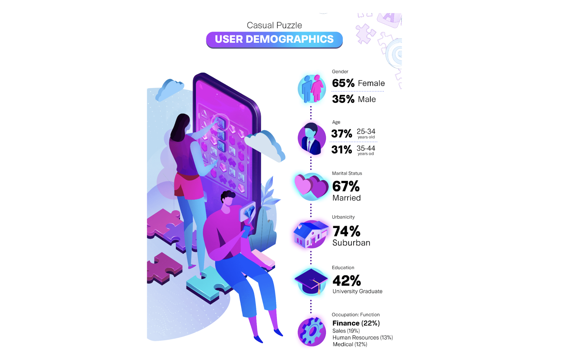
Who is your target audience? This is a much-dreaded question game developers ask themselves at every stage of game development. And if the game you’re working on is a match-3 puzzle, there is a widely accepted assumption that your target audience primarily consists of women aged between 25 and 45. There are many more details that you need to figure out once you start the process such as determining the game’s theme or the personalities of your characters etc, but this overarching statement about casual puzzle player demographics is widely used as a rule of thumb.
A very casual summary of the casual puzzle player demographics. (Source: https://www.aarki.com)
That’s it then! Just design a game targeted for women between the ages of 25 and 45, and you’re all set! Only if it was that easy… The casual puzzle (specifically match-3) market is so crowded that it is incredibly difficult to distinguish yourself from the others. You have to compete against the giants such as King, Playrix, and Dream who are not just about developing one game, but creating their own IP across multiple games.
When the market seems so saturated, you need to start looking at the blue spots in the red hot ocean. That is exactly what Space Ape is trying to do with their latest release Chrome Valley Customs. The game can be defined as a male-focused match-3 with car restoration and customization as the theme. You join a crew of car mechanics to fix customers' cars, solve match-3 puzzles, and progress through the story.
Defining your own niche
Although the mobile games market is a bloodbath with numerous games being canceled and studios shutting down, match-3 still seems appealing for teams developing new games. There aren’t many technical difficulties since both the core and the meta gameplay are simple with respect to game development. Also, because the end game offers that let players purchase extra moves are the most effective monetization method, the economy design is relatively straightforward, too. Of course, with this much simplicity comes an increased importance of creativity while developing your game. Some tackle it through using their existing IP like Royal Kingdom while some mix and match different best practices from the market like Makeover Match. Space Ape’s approach is targeting (or maybe even creating?) an assumed underserved audience within the match-3 space: male players.
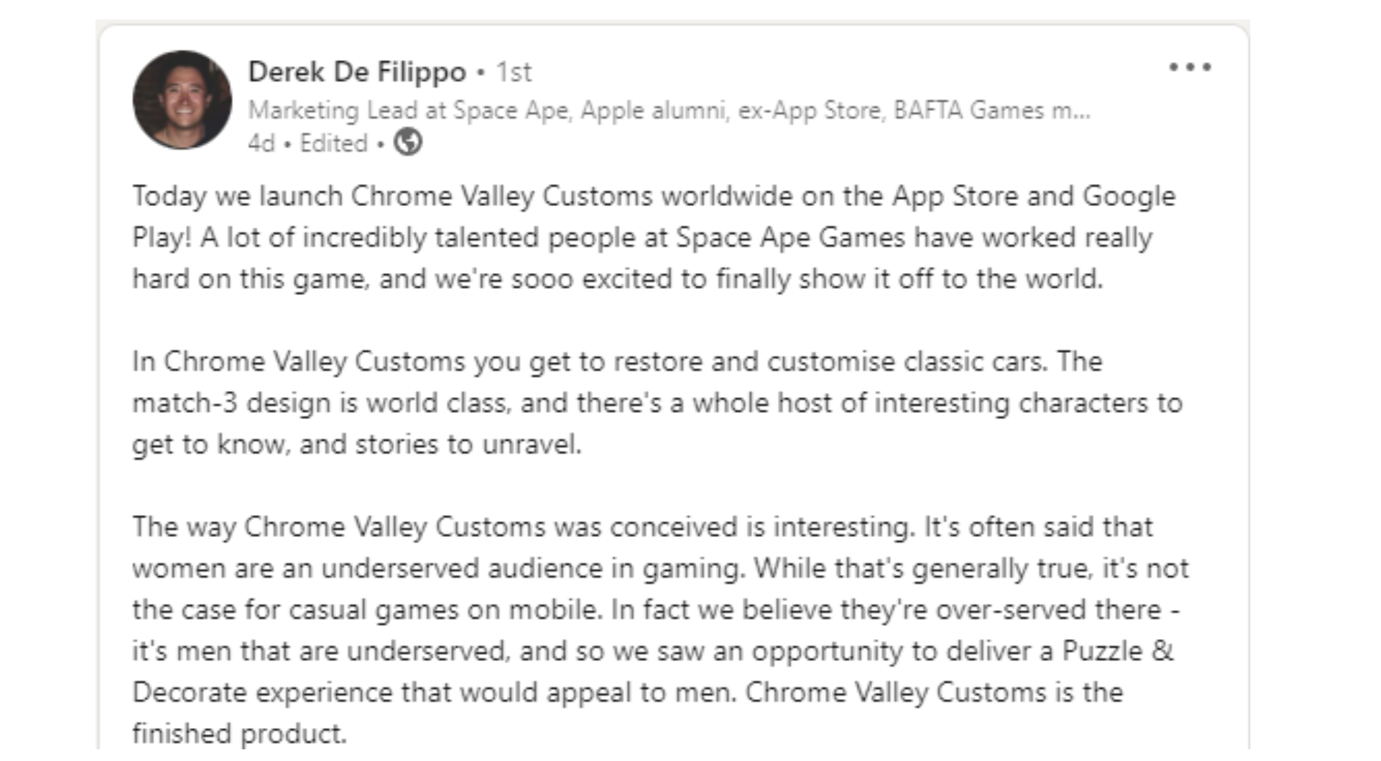
Chrome Valley Customs explained by its own Marketing Lead.
Yes, males being underserved is quite counterintuitive considering the world we live in and the rest of the games on the market, especially in other genres such as midcore. But there are not many successful match-3 games specifically targeted at males. Puzzle RPG is the first thing that comes to mind for puzzle games that target a male audience. Puzzles & Survival and Empires & Puzzles are the two most prominent examples, but they have never reached the popularity of Royal Match or Gardenscapes, for instance. Since a puzzle RPG feels more like an RPG rather than a puzzle game, it ends up being too niche to become that popular. So, Space Ape avoids falling into the same trap and instead chooses to follow the best practices in the market while also adding their twist with Chrome Valley Customs. The game comes up with an original proposal of having a story that is quite masculine yet still includes themes that are diverse and widely appealing.
What do you get if you mix Project Makeover with Need for Speed?
Even if you don’t have a special interest in cars, modifying your cars in Need for Speed is a great feeling. You unlock a car, make so many changes ranging from its paint color to the taillights, and drive it inside the game. I think the reason why something as simple as changing the color of a car can be so satisfying is that it gives you a sense of ownership and the ability to personalize the cars, making them your own through those changes. In the end, escapism is a strong motivation for any gamer of any gender that wants to feel empowered, richer, stronger, and more…
Choosing the color of your car in Need for Speed (left) and Chrome Valley Customs (right).
Of course, if you are designing a match-3 puzzle, not a racing game, you need to find an appropriate way to fit Need for Speed into a coherent story. Chrome Valley Customs achieves this by incorporating a storyline that is similar to the one used in Project Makeover. You join a crew working in a garage that helps customers restore their cars. Each episode is centered around the customer and their car. The player restores and customizes the car while exploring the story behind via the narrative. Replace the garage with a beauty salon, and the car with a room, and voila! You have Project Makeover.
Crew talking in Project Makeover (left) and Chrome Valley Customs (right).
With regards to how the player progresses through the story, Chrome Valley Customs uses the well established way of having a task list and getting the player to do them one by one via spending coins you earn by beating levels. So, in terms of both the narrative structure and the story progression, it follows what is tried and true.
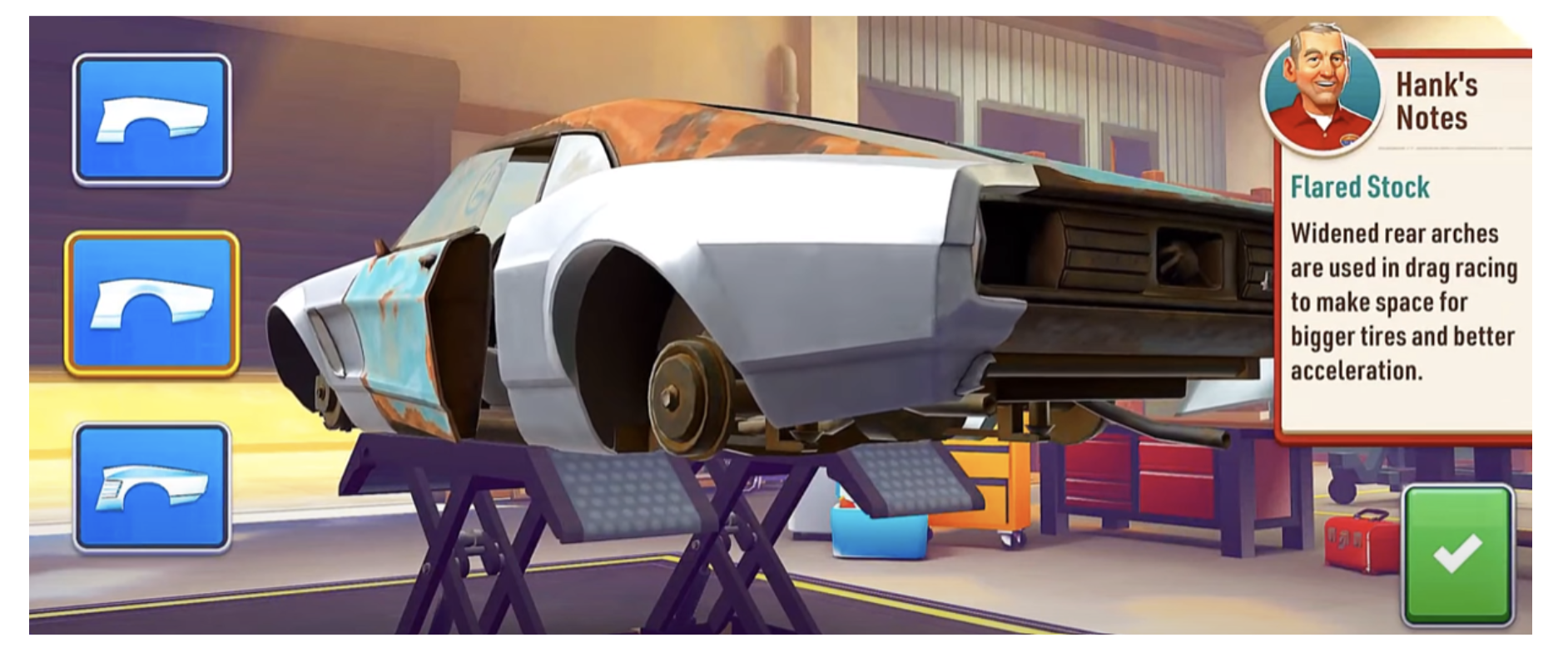
When it comes to restoring and customizing the cars, however, the game offers small details that show the team worked a lot on how to best fit the theme with the rest of the game. As with many other Puzzle & Decorate games, Chrome Valley Customs lets its players make a choice between 3 options when they make customizations. Their twist: informing the player about each and every option they are about to make. They give short snippets of information along with each option which makes the whole process much more enjoyable and informative at the same time.
Uncle Hank schooling us all.
In addition to the classical 3-option customizations, the game also lets players do customizations on a much larger scale. We have already talked about choosing the color of the car which usually has 10 options. You can also adjust the height of your car which can sound like a miniscule detail but creates a distinct visual difference. Finally, being able to design the interiors of the car such as the seats or the steering wheel makes the whole customization feel much more complete.
In terms of the atmosphere of the game and the overall feeling it gives, it almost feels like playing GTA. Rock music plays in the background while the menu is quite simple and the colors are quite desaturated (unlike most other match-3 games). And with the ability to take a photo of your car at any given moment and save them to your “scrapbook”, the game certainly appeals to the collectionist players who like to look back at their car designs.
A visual style dedicated to adult males?
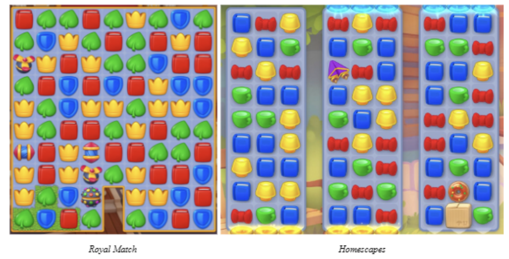
Match-3 space may have an infinite number of games each with different features, but one thing has been proven to work for sure: having game pieces that are easily distinguished. It is important to keep the mental load as low as possible for your players so that they can last longer playing your game. And when the board has pieces that are distinctly different from each other, it becomes easier for players to detect patterns and keep playing.
This distinction can be created through a number of ways. First of all, using saturated and bright colors is a great help, because it is going to make the pieces stand out from the rest of the screen. The size of the pieces is another factor since it is obviously a lot easier to detect a large piece on the board. Finally, the shapes of the pieces should also be different enough from each other so that the players won’t be confusing them with one another.
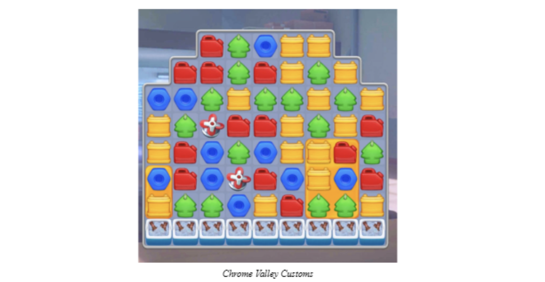
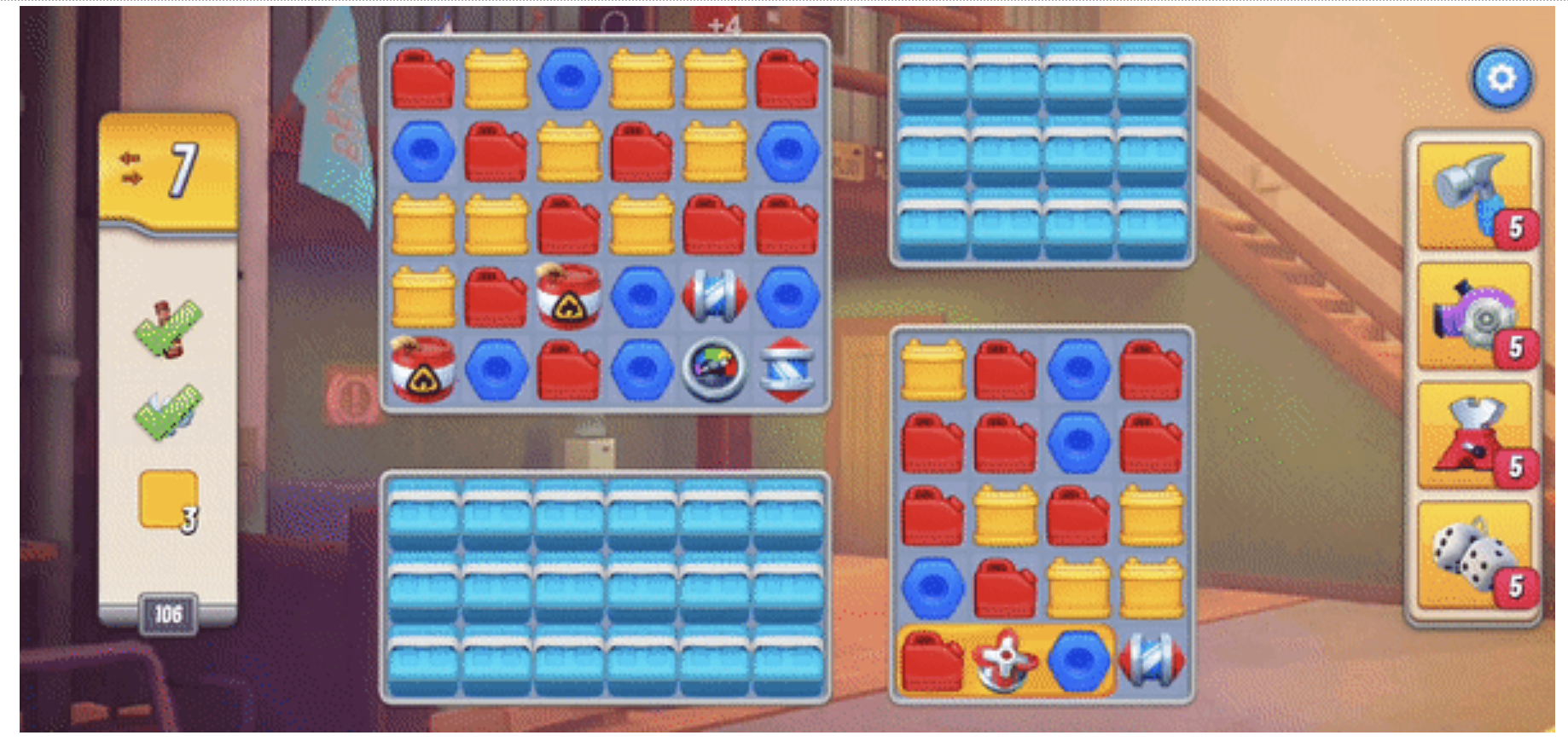
Chrome Valley Customs does quite well in terms of shape and size. The pieces have different enough shapes and they cover quite a lot of space inside their grids, making them large enough. However, the color choice seems to have made the game seem a bit darker compared to most other games. When we look at the most successful match-3 games like Homescapes or Royal Match, Chrome Valley Customs feels like the pieces could have been brighter for better visibility. They are still distinguishable enough and this shouldn’t create a blocker for the players, but I think there is still room to grow in the saturation department.
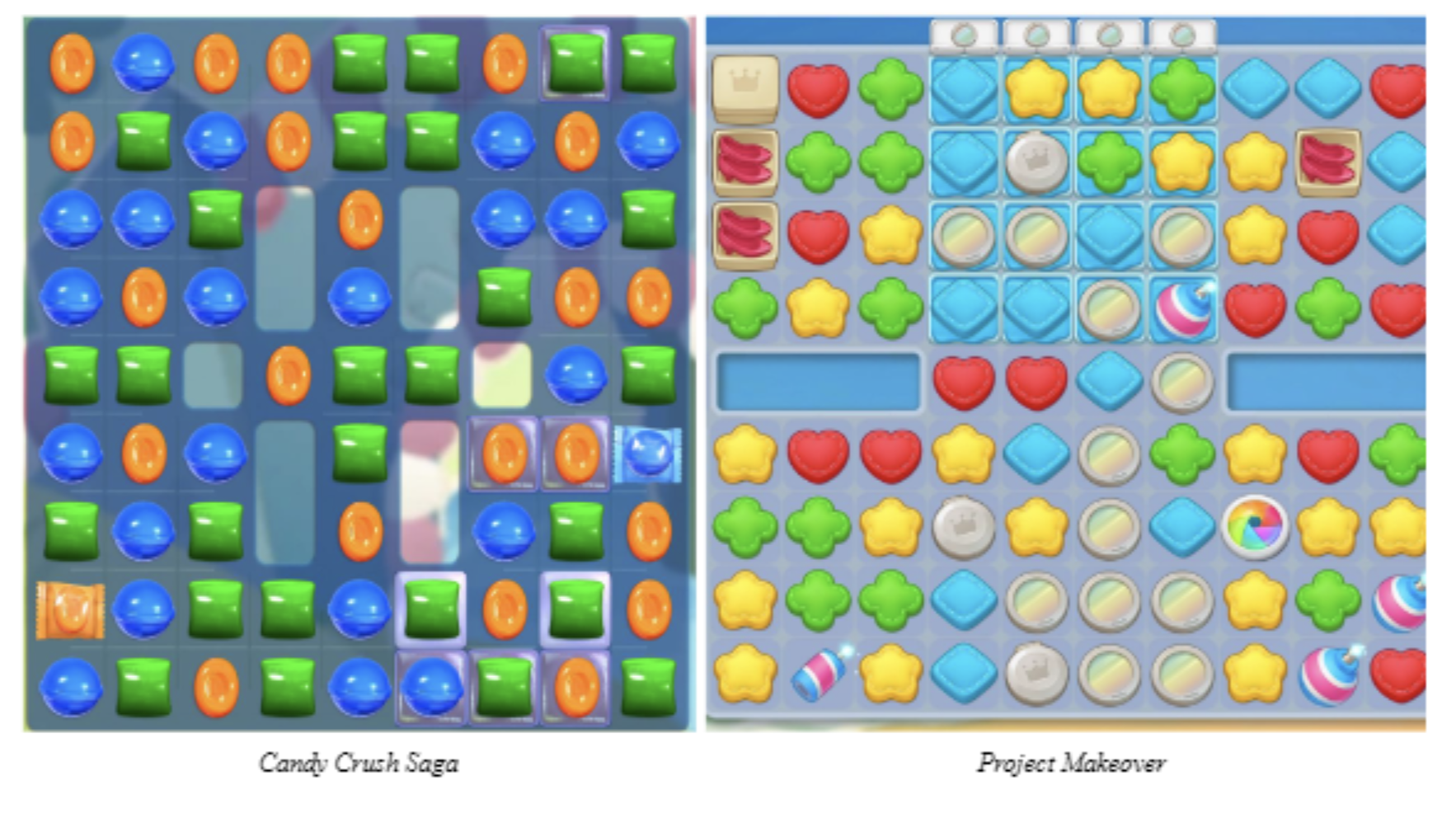
In addition to this rather scientific way of approaching the visual style, there is another factor which I find quite effective in making the core gameplay more attractive: the volume of the pieces. Unless you are playing a VR adaptation of your favorite match-3 game, you will be seeing 2D visuals on the board. However, this doesn’t mean the pieces have to fall flat. Many of the most successful match-3 games use pieces that can be described as being almost “2.5D” thanks to their volume. It helps the pieces pop out and feel like they have depth even though they are still 2D visuals.
Royal Match and Homescapes are the best in class with respect to the volume of their game pieces. Each piece has been given extra depth either through lighting or the actual shape (like the book item in both games). Candy Crush Saga is also notable especially with the use of lighting and how each piece is highlighted in a different way to give volume. The orange candies are given a cavity while the blue ones are given a bump through the use of lighting. Project Makeover uses a rather straightforward method with adding a bit of thickness to the lower end of each piece and it still looks effective. Chrome Valley Customs, on the other hand, looks almost “flat” compared to the previous games. The pieces certainly have details and even the thickness in some cases similar to what was mentioned with Project Makeover, but it doesn’t look quite effective enough.
And why is all that even relevant? Because games do not compete against other games only. Every other entertainment business such as movies or animation is also a competitor. Since those businesses provide their users with a rich and immersive experience through high quality visuals, games have to come up with their own solution to not stay behind. Having more volume in your pieces that make them stand out is just one solution. But there are many other solutions such as the quality and the variety of the animations used in the game or the speed in which things happen.
One important question at this point is about the target audience and all the assumptions that have been made about the visual style. As the game targets the underserved male audience within the casual puzzle space, I’m not sure whether Space Ape would ever change this rather flat visual style. It’s hard to find anything about what men would like to see when they play a match-3, so maybe this is a result of their research? Could male players like a little bit of simplicity with their match-3? Of course, this is more speculation than analysis at this point…
A gameplay that suits the visuals
The core gameplay experience of Chrome Valley Customs is quite in line with its car theme: fast. We talked about how games compete with every other entertainment business and how high the bar is for visual quality. The strongest weapons in a match-3 game’s arsenal for improving visual feedback are the in-game animations and particles. Because the most frequently repeated action is matching objects and triggering power-ups, the visual feedback of those actions carries a heavy weight on how fun the game is. I think Chrome Valley Customs does a fine job of animations and particle design. They cover a significant area on the board and are quite detailed when you take a closer look.
However, that’s the problem with animations. The game is so fast that you can’t really comprehend what is happening without taking a closer look. It actually uses concurrent matching (the ability to make matches while the effects of the previous move are still in motion) to make it even faster, which I personally like. But the visual feedback is incredibly fast which does not give a great sensation even when you do great combos in succession. Designing a car themed game and choosing speed over anything might feel logical at first, but if you don’t give enough time for your visual effects to be seen by your player, the overall effect will be suboptimal.
Look how fast the collectibles are moving across the board.
This takes us back to the speculation about the target audience of the game that we talked about before. Is it somehow possible that the underserved male audience who are into restoring and customizing cars also like a really fast match-3 experience? If the animations or particles themselves were lacking quality, I wouldn’t suggest this since it would be a problem of its own. However, when you have well designed visuals that are not given enough screen time, it makes you wonder…
Another thing that can be improved with respect to the core gameplay is the difficulty of levels and how they are communicated. I think it is well known that you need to design carefully the number and the order of difficult levels in order to not tire out your players. It is also important in terms of the economy design. The end game offers that players buy to get extra moves when they fail a level are your best friends for monetization. Finally, when you have a well designed level cadence that has near fail and near success moments happening frequently, it increases the overall enjoyment a lot.
I think the game can still improve in this department for a few main reasons. First of all, there aren’t many difficult levels that challenge the player. Although you want your players to start on an easy path and not fail a lot in the beginning, it took me 76 levels to fail in Chrome Valley Customs, which is a bit high compared to my experience on other games. More importantly, the levels that are shown as “difficult” by the game itself are not actually that difficult. Also, I can’t really say the levels feel like you are avoiding failure by the skin of your teeth since it is very common to finish a level with 5+ moves left.
Final Inspection
Chrome Valley Customs is a well-crafted game in many aspects. The story is not as simple as “Let’s repair cars”, but also not drama heavy like Project Makeover. The car customizations are designed to complement the story, ensuring they feel connected and cohesive. The flexibility of the customizations and getting to learn about the parts that you use make it even more relatable for the player. Gameplay is quite fast and smooth while the visuals are not too shiny but still have that casual puzzle vibe. However, I think there is one important question the game has to answer: Is the targeted audience big enough?
Designing a car themed match-3 means they are fine with not targeting a large female player base in general. Of course, this doesn’t mean 90% of the players will be male, but it will certainly have an effect on acquiring and retaining female players. On the other hand, can male players who will enjoy a car themed match-3 compensate for that loss? Because the game is quite good and it looks like the parts that don’t fit the bill, such as the less saturated colors or the faster gameplay, are there intentionally for that target audience.
I think Space Ape is betting on something that is worth pursuing. Everybody knows how hard it is to produce a hit in the match-3 space and how rare they became in the recent years. So, they are targeting a supposedly blue spot in what can be described as the reddest ocean in mobile games. Whether this is in fact a blue spot or not is something we will all see in the next few months. But I believe Space Ape is making a very clever move…
Written by Ahmetcan Demirel.
P.S. Special thanks to Laura Taranto for her invaluable insights and feedback.

